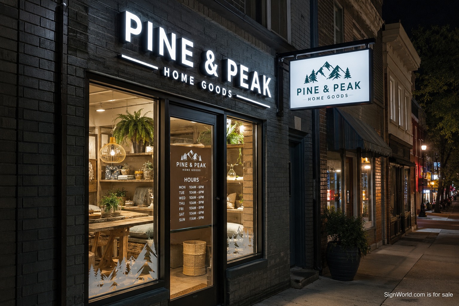
A storefront sign package is the complete set of visual cues that helps a customer find the business, understand what it offers, locate the entrance, and confirm practical details. The primary wall sign gets most of the attention, but it is only one part. Window graphics, door hours, awnings, blade signs, address numbers, pickup markers, and code signs all share the same elevation. Planning them together creates a clearer storefront and prevents each vendor from solving a separate problem in a separate style.
Begin with movement. A driver sees the building from farther away and at a narrow angle. A pedestrian approaches slowly and may walk parallel to the facade. A customer at the door needs hours, accessibility information, and unit identification. Photograph each view at the expected time of day. Note trees, parked vehicles, columns, canopies, neighboring signs, glare, and exterior lighting. Those observations determine which sign type has a real job.
Assign one job to each surface
The fascia or sign band usually carries the primary identity. Channel letters, dimensional letters, or an illuminated cabinet may fit that zone. The selection depends on landlord criteria, wall construction, brand artwork, viewing distance, and nighttime requirements. The broad survey of commercial sign types from UNI Signs can help a team identify formats before the site-specific review narrows the list.
Windows should not repeat the wall sign at full volume. They can communicate services, privacy, seasonal messages, or atmosphere while preserving sight lines required for safety and merchandising. Door vinyl should handle hours, address, suite, accessibility, and a concise web or phone detail. A blade sign serves people moving along the sidewalk and needs a readable shape from both directions. An awning can provide shelter, color, and identification, but copy on several valances quickly becomes cluttered.
I notice this conflict often in ordinary family errands around northern New Jersey and the New York City suburbs. After more than twenty years working from home, I may be picking something up while my wife is home with our preschool-age son. From the parking lot, the main letters identify the row. Once I am under the canopy, those letters disappear above me and a small blade or clear door mark becomes more useful. A package should follow that changing view.
Read the landlord criteria early
Shopping centers often control letter height, allowed colors, raceways, returns, illumination, sign-band location, window coverage, awnings, and removal obligations. The lease may require landlord approval before municipal submission. Request the current criteria and an accurate storefront elevation before design begins. If the criteria conflict with the brand standard, resolve the exception in writing. Fabricating first and asking later can create expensive changes.
A catalog such as Thomas Sign’s sign-type overview is useful for vocabulary, but the package still has to fit one building. Verify wall material, sign-band dimensions, concealed utilities, interior access, canopy depth, glass type, mullion spacing, sprinkler clearances, and electrical capacity. A field survey should record measurements and photographs, not merely confirm that a storefront exists.
Build a hierarchy
Give the brand name the strongest position and contrast. Place a short descriptor only when it answers a real customer question. Keep secondary services on windows or another suitable surface. Hours and entry information belong at eye level near the door. Address numbers must comply with local requirements and remain visible to emergency responders. When every surface shouts, no surface leads. A hierarchy lets each message appear at the distance where it can be read.
The practical design rules described by The Crazy Pixel reinforce the need for clarity and readable contrast. Test layouts at scale. Print a portion of window copy at full size. Place a temporary paper rectangle where the blade sign will hang. View the elevation from the opposite drive aisle. Small simulations expose weak type and blocked positions before production.
Coordinate color, light, and material
A package looks coherent when materials repeat with purpose. The same return color can connect channel letters and a blade-sign frame. A window accent can pick up the primary face color without copying the entire logo. Awning fabric should be selected from a physical sample under daylight. Translucent acrylic needs a night sample because illumination changes color. Warm and cool exterior lighting can also shift the appearance of paint, vinyl, and faces.
Decide how the storefront should behave after dark. The primary identity may remain illuminated while window graphics recede. A blade sign can be internally lit, externally lit, or unlit depending on code and pedestrian traffic. Door information needs enough ambient light to be found safely. Timers, photocells, dimming, and center operating hours should be included in the electrical plan rather than added after neighbors complain.
Sequence design, approval, and installation
A dependable sequence begins with criteria and survey, then concept design, landlord review, code check, detailed drawings, municipal permits, fabrication, site readiness, and installation. Window graphics can often be produced faster than custom letters, but installing them too early may expose them to construction damage. Awnings may require separate structural attachment. Blade signs need careful coordination with wall framing and sidewalk clearance. One schedule should show these dependencies.
The comparison of channel letters and cabinet signs from AlphaGraphics can help with the primary sign decision. Whichever format is selected, request shop drawings that show dimensions, materials, colors, lighting, mounting, power supplies, attachment, and electrical requirements. Give the general contractor enough time to add blocking and circuits before walls close.
Budget by package and phase
Ask for an itemized proposal that includes survey, design, permits, engineering if needed, fabrication, installation, electrical connection, access equipment, removal, and patching. Separate permanent identity from changeable promotional graphics. If the opening budget is tight, preserve the primary sign, required door information, and a clear pedestrian cue. Seasonal window work can follow. Avoid filling temporary gaps with graphics that later compete with the permanent package.
At closeout, collect approved drawings, permits, paint and vinyl specifications, warranties, electrical details, timer settings, and final photographs. Record how each sign can be reached for service and who owns removal at the end of the lease. A planned storefront package feels simple to the customer because the complex choices were settled before fabrication. The result is a facade that can be found from the road, read from the sidewalk, and understood at the door.